Northview Lunch: The Breakdown
I created this infographic about food and packaging disposal to go with a feature story about local environmental protection, in the hopes of educating our student body. In Adobe Illustrator, I drew a typical school lunch offered by Northview, including beef dip nachos, tomato salad, TruMoo chocolate milk, and an apple and packaging to make the lunch recognizable for any Northview student. For the information squares and background, I used colors that were already present in the lunch illustration to keep the whole design cohesive. The title "Northview Lunch: The Breakdown" is a play on words, since it refers to both the different components that make up the meal and packaging, as well as how these components literally decompose.
College List 2021
I wanted the Class of 2021 to recall fond memories from their high school career when they looked at the college list, so I based the theme on The Greatest Showman, a very popular movie released during the freshman year of the Class of 2021. For the title, I designed a font similar to the font used on the movie cover, making sure to add shadows and texture. The stagelights and stars in the background are based on the movie cover as well. I also illustrated the main characters in The Greatest Showman for the first and second spread and carnival props for the third spread.
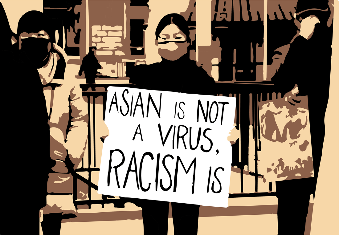
Rise in Anti-Asian Racism
I drew this graphic for a news story about efforts to address anti-Asian Racism, basing it on a photo from a protest. I chose this photo specifically because it was widely circulated on social media, so most members of the Northview community would recognize it immediately. I stuck to a muted and very limited color palette to match the more serious nature of the article and used different variations of yellow to represent the undying nature of the Yellow Peril, and how the COVID-19 pandemic has brought this previously dormant concept back in full force. I left the girl's sign in the center as the only white area in the illustration to allow the message "Asian not a virus, racism is" to stand out.
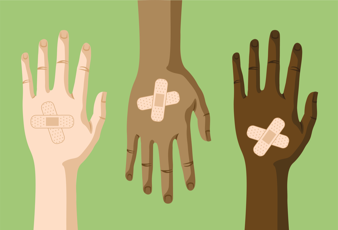
White Privilege
This graphic was for our copy editor's op-ed on white privilege. I decided to illustrate how the default 'nude' bandaids, often the only shade sold in stores, only match the skin tone of white people. Through my illustration, I wanted to convey the op-ed's message that people of color are underrepresented in everything from beauty products, to toys, to television. Although whether a bandaid matches one's skin tone seems inconsequential, this complements the op-ed well because the lack of representation in bandaids is a symptom of the larger issue of white privilege.
Recruitment
This animation, published on our social media, was intended to attract prospective staff members for the next school year by demonstrating how working on The Messenger involves more than just writing. To create the animation, I drew over 50 images in Adobe Illustrator, combined them in Adobe Premiere Pro, and adjusted the time interval for each image to create a smooth transitions.
